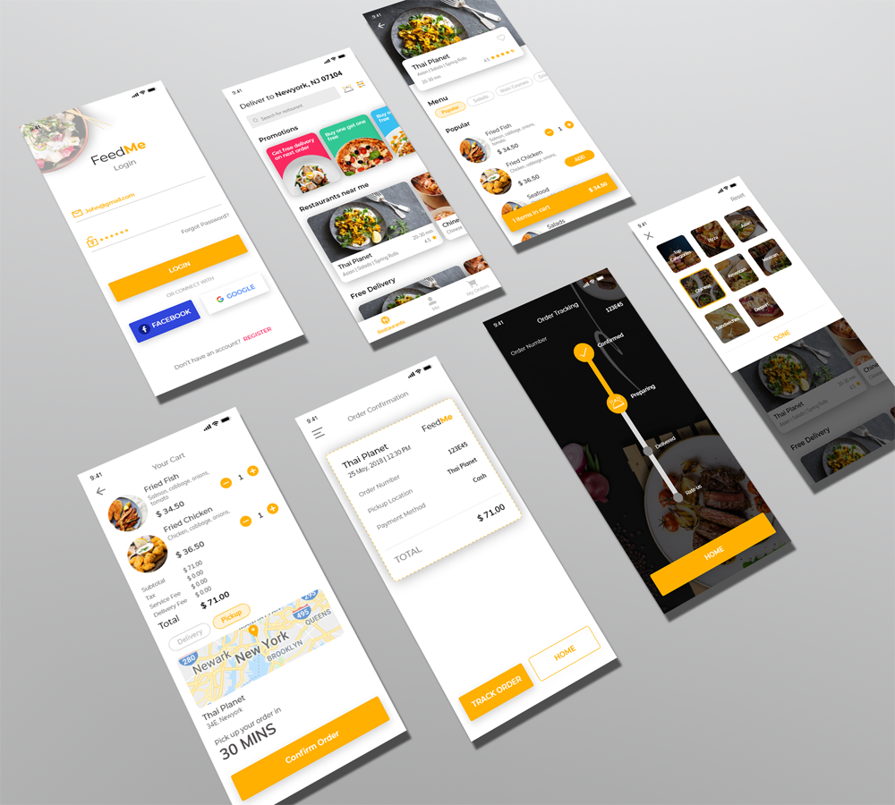
This case study describes my process of designing the app from the idea of it to the final stage.

Challenge
I found that factors contributing to the popularity of online food ordering were: lack of time to prepare food, availability of variety, rewards and cash-backs. It led me to think of convenient and more attractive app for users in order to meet their expectations more precisely while ordering food online.

Task
- Create UI/UX design of Mob App for ordering food online.
- Researching
- Survey
- Wireframing
- Interactive Prototyping

Tools
- Adobe XD
- Photoshop
- Google Doc- survey
- Invision

Problem Definition
The mobile aggregator is an application that combines various thematic platforms in order to increase their level of sales and ensure the convenience of the choice of dishes and drinks by users. A distinctive feature of the application is a single design, user-friendly interface.
I decided to create competing app where to make an order should be as simple as few clicks on mobile device. And it should be easy to understand and informative about the options and choices the users have.
I decided to create competing app where to make an order should be as simple as few clicks on mobile device. And it should be easy to understand and informative about the options and choices the users have.

Process
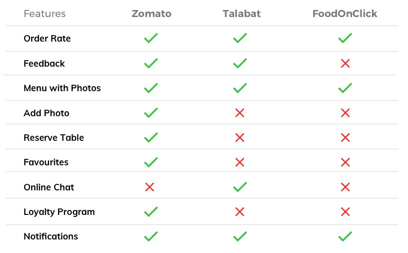
I’ve started the process with competitive research and I identified top three competitors. Analyzing and comparing the content of their apps helped me to determine the direction of development for FeedMe application.


User Personas
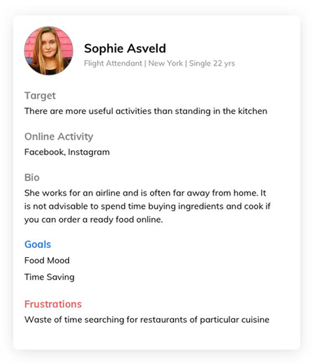
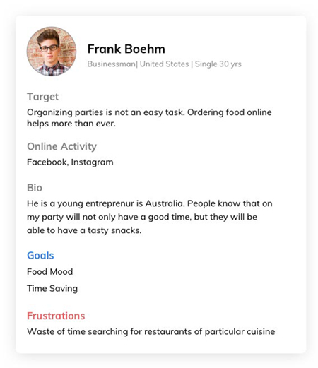
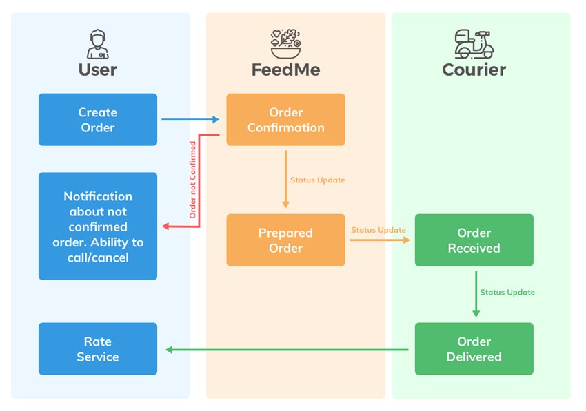
When I had a better understanding of user’s needs I’ve made Business strategy diagram.

Inspiration Moodboard

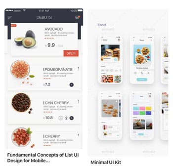
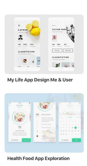
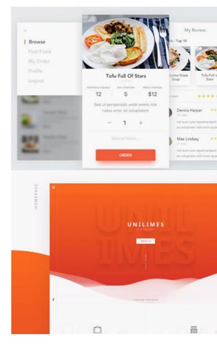
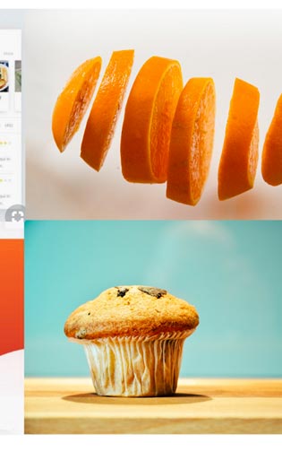
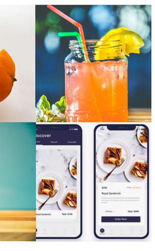
Then I did analysis of colors, their perception and influence. The orange is a warm color. If you want to create an atmosphere of warmth and friendliness, you can safely choose orange. In addition, orange can add feelings of confidence and vitality, as well as stimulate the appetite. Orange should be used for products and services that are designed for a wide audience, as it creates the impression of low prices. This is how I came up with the mood board.

Wireframes
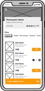
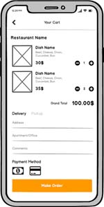
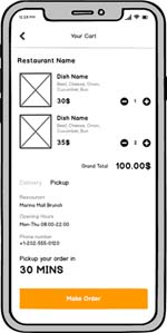
Wireframes are used early in the development process to establish the basic structure of an app before visual design and content is added. In the ideation phase I created wireframes presenting information architecture of the future layout.
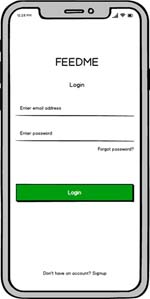
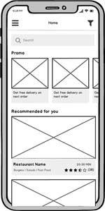

UI Design
Choosing colors for designs in general is not easy. So why can’t we just choose colors for our projects based on how we feel about them or based on the trends? I’ve become more aware that knowing color theory, preferences and background of the client, culture of users and comprehension of your audience and competitors is the best way to choose right color for your project.
